15 tips for improvement of website usability
The word usability itself means "ease of use." And in our case, we are talking about the site. For the resource to enter the top and be really in demand, you need to make sure that the user lingers on it so that he finds the necessary information on the resource pages. As a result, you receive incoming traffic converted into requests and calls. But how to make the site simple and, at the same time, in demand? This article will tell you what usability is and how to make your site user-friendly.
What is website usability?
You already understood that a web site's usability is the degree of its understandability and ease of use. Most web projects are to make a profit. Therefore, it is essential to follow the principles of usability. They affect the user's mood and behavior. For example, how quickly he will leave your resource, whether he found the answer to his question, whether he will go to a competitor's website due to a lack of necessary information, etc.
Your task is to attract the user and keep him. By not doing this, you lose customers. Here the arithmetic is simple. And even if you think that a site stuffed with some chips will be more interesting than a minimalist resource, you are mistaken. You need to create a project that will be user-oriented.
Read more about six tips for writing a successful blog.
Why is it important to follow the principles of website usability
Based on usability, it is not so difficult to conclude that it is necessary. A properly configured site can:
- increase the conversion rate;
- increase the size of the average check;
- increase the frequency of orders, etc.
Let's add that conducting a daily usability test is unnecessary. There are several reasons why this is necessary:
- determine the cause why the site has a low conversion;
- test several interface options and decide which one is more effective;
- fix existing bugs, etc.
What affects usability?
Many factors affect the usability of a website. And before correcting any errors, they need to be found, which requires an audit. When you get the result, you can start work on fixing errors. We will tell you what affects usability to clarify what to want.
Read more about: How to succeed in everything?
Remove redundant information
Too much information is just as bad as too little. According to statistics, 62 online shoppers leave an online store because the site has a lot of unnecessary text.
Halving content can lead to a 58% increase in usability. Good enough, and the conclusion is simple: remove unnecessary words. In any case, the user reads only 28% of all information.
Post content according to the principles of eye tracking
Yes, usability is about making a website more accessible. But it's not as easy as it seems.
The upper left part is the best place to place important information. It's a sin not to take advantage of this, given that marketing research has already been done before you, and it remains only to do it right.
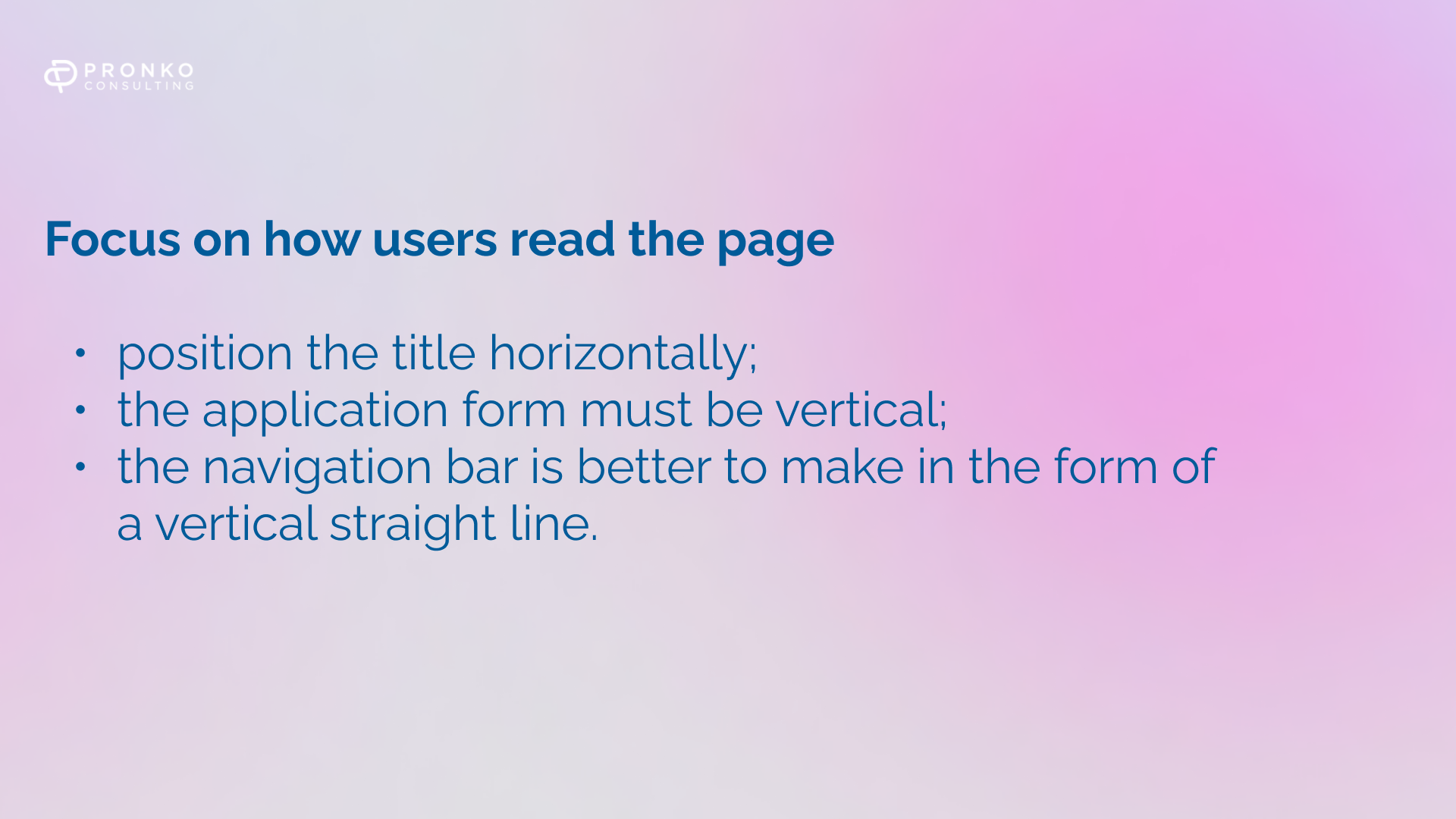
Focus on how users read the page
To make the site useful for the user, you need to study the habits of the same user. Most people first explore the two horizontal lines on the first screen and then watch other content in one vertical line until the end of the page. Popularly, this reading format is called the F-pattern. Knowing this, you can use the following tips:
Fast page loading
Nobody likes to wait. 4 out of 5 users will leave a site that takes more than 250 milliseconds to load. And it doesn't matter if it's a news site or an online shoe store; you can always find a resource that will load faster.
Search window size
Site search is an essential feature for any website. Most resources, for some reason, make the search string size 18 characters. And what is most interesting, this size accommodates only 27% of all requests, and it's not less than half, and it's a quarter. If you want to please your users, increase the string to 27 characters, accommodating 90% of requests.
Page layout
It is important to use the same layout for all pages. Ideal size: 1000-1600px long and 770px wide.
The navigation bar should also be the same on all pages.
Read more about: Loyalty programs: how to increase conversion on a special promotion.
Typography
Nalyapistye sites remained in the 2000s, and they probably did not know what a beautiful and high-quality place was. Now, minimalism is in fashion. But if you create a resource using multiple colors and fonts, keep this number to a minimum. For example, four colors are enough.
Make the title width no more than 75 characters.
Links
The universal color for links on the Internet is blue. Make them blue accordingly. The user should immediately understand the tie in front of him.
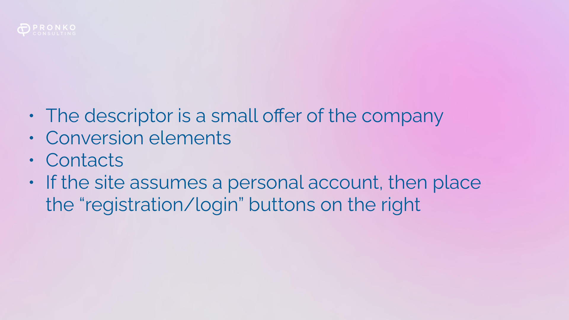
Work out the site header
The site header is located at the very top of the resource and should be as informative as possible. To do this, place in it:
Work on the main page of the site
The main page of the site is its face. Here it is important to briefly describe your offers and motivate the user to take action. There is no need to overload the page with SEO texts, and at the same time, do not leave it empty. To improve the usability of your homepage, consider the following:
- Bright banner. It should be noticeable and place the most profitable offers for the user on it. The main thing is not to overdo it.
- Benefits section. It is not a fact that the reader will believe what you write about yourself, but we recommend doing so. 5-7 benefits will be enough. Not bad if they are with numbers. For example, five years warranty or ten years on the market. To make the text read better, create a list of benefits and add icons.
- Place links to essential pages of the site.
Work out the navigation elements
Remember that the website is for people. Therefore, to keep a person on your resource, ensure he can easily navigate it. To do this, work through the navigation. Namely:
- Menu. Horizontally should display the category of services and goods. Do not make categories more than three levels. The vertical menu should reflect the structure of the site. You can create multi-level lists and highlight them with color. Remember that the menu should be user-friendly. Too bulky will scare the user.
- Site footer. Many duplicate the top menu, but this is not necessary. You can place them: contacts, a block with links to service pages, and info pages. You can also set up a partnership with legal information.
- The up button. When a user studies the site footer, it is not very convenient for him to navigate back to the top using the mouse scroll. It is much more convenient to click on one button on the site. Often they are created in the form of an arrow up.
Work on product/service pages
If you have an online store of goods, then make sure that the user studies it and makes an order. To do this, improve the following sections:
- Page directory. It must contain photographs (of the same size and format). Invite the user to buy a product in one click. Make the order button visible.
- Card Product. Place the product photo on the left, add the zoom feature and place an image from multiple angles. These things will allow you to evaluate the product from all sides. On the right, indicate the name of the product and price. Add a description of the product and delivery terms.
Work out the functionality of the order.
When you want to buy a product, you are unlikely to have a desire to fill out a meter form, where you need to enter dubious data. How to create the perfect order or callback form? Just follow our advice:
- Keep the number of fields to a minimum. To order a product, a person needs to indicate a phone number or e-mail. Of course, you can add something else to collect information, but tell the user which fields you can and do not fill out.
- Ideally, remove the captcha. But if it is necessary, then install the simplest one. People are annoyed by wasting time looking for pictures of cars or trains.
- The button for ordering goods or a callback should be bright and noticeable.
- Place an inscription on the consent to the processing of personal data.
- After the user fills out the form and submits it, he should receive a notification, during which time the team will contact him. It is also essential to work out the "Basket" section. Visualize added products. Be sure to include the total cost of the customer's purchase. Also, offer the user several delivery types, indicating each option's price.
Increase the loading speed of the main pages of the site
We already wrote above that if the site loads poorly, no one will stay on it for more than 5 seconds. Therefore, you need to focus on making the resource load faster.
We recommend paying attention to layout and content. It may be necessary to reduce the size of the web page itself or its images. Also, optimize JavaScript and CSS codes, reduce the number of editors, etc. Pre-test the page loading speed using free (you can choose paid) services.
These are not all the recommendations, but these are the main ones. Make the site convenient not for search robots but for people.